Got a new project today in my 1st hour class and it's call "TYPOGRAPHY"! In this project, I'm suppose to create a group of designs based on letters, fonts and word designs. First I would pick up a word and somehow design it with different fonts that would interpret the word. I could pick a images to go along with it. This is my project for now>.< GOTTA GO!!!
Monday, December 14, 2009
Thursday, December 10, 2009
Wednesday, December 9, 2009
ADVERTISING
Tuesday, December 8, 2009
Hmmmmm........
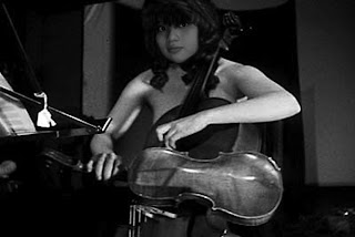 Okay, another photo for this project....Didn't work out the way I wanted it to but yeah...In this photo, I used every tool that was needed... And those tools are the smudge, blur, cut and paste, and images size, clone, and etc... It really takes time to just fix one picture....I'm currently working on another one....so just wait forward to see the next one>.<
Thursday, December 3, 2009
SAY CHEESE!!!!!
Tuesday, December 1, 2009
Being Rich....
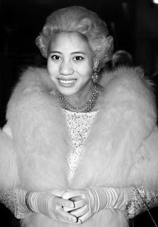
Another picture for the project...When I work on this photo, it gaves me the feeling of being super RICH. The reason I say this is because, by looking at her outfit and the jelwery that she had on, you can tell that she's rich. Annyways, I think this photo is not bad...Let's hope I will make a better one next time...>.<
Tuesday, November 24, 2009
Third Images!!!>.<
Monday, November 23, 2009
Second Images....
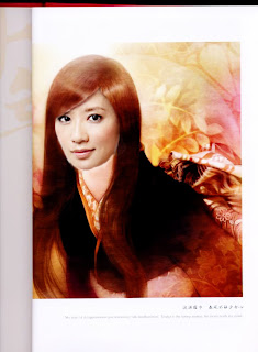
Second Images of this project!!!! Well, I didn't use anyone that I know of...but instead I Photoshop the anime face to one of my favorite taiwanese Actress. I hope it's alright with the project...anyways, this is my second images.
And umm...In this images, I uses the colon tools, the cut, paste, the dodge, and burn tools. So basically, I could say that I use almost all of the required tool.
To me, I personally think that I like this photo better than the first one. The reason is because, their face blind in better and the quality of this images looks better! Therefore, I really like this photo!!!>.<
Wednesday, November 18, 2009
Back to the past creating a retro/vintage look/ yearbook look
This is a new project given to me in class on the 16th of November.
So basically, "Back to the past creating a retro/vintage look/ yearbook look " means to modeled something from the past.
In this project, it's require to pick an old photo and photograph it with the close-up setting on the camera. The setting on the camera is the tulip or the flower symbol. When taking the photo be sure to hold the camera so that the images is not distorted. Also, you should be making sure that the borders are parallel with each other.
Again, Use photoshop editing software to get the retro look. And so on...
On this project I'll be using Layers, copy &Paste, blur tool, adjust contrast, selected wand, cut, Eraser tool, letter tool, transparency and many more other tools on Photoshop.
Thursday, November 12, 2009
Xee Vue/Artist Statement
“Plain and Simple”
A quote that simply I made up to describe my photo that I had taken so far. Basically, I’ve been focusing on many different projects but all of them I did edited it in Adobe Photoshop. In Adobe Photoshop, the tool that I would use the most often is Smudge, Burn, Dodge, Blur, and the desaturated and saturated Tools. Basically, I would just say that I used all of the regular tools.
So as for right now, I’m focusing on Street Photography. In Street Photography, I edited it in Adobe Photoshop, like the others project, but instead of using only just those tools in there. I used Artistic Filter, Paint Buckets, and the Gradient tools. I chose to use these tools in the Adobe Photoshop because according to my vision or my thinking, I thought that probably this would make my photo stand out more. Within these three tools, I would use the Artistic Filter more often. I guess I just like how it makes my Photo turn out into a totally different photo. For example, I would use the Colored-Pencil, Outlet, Charcoal, and Poster Edges. Out of all the Artistic Filter, I liked using the Poster Edges because it makes my photo shows the black outline of it and I liked how it makes the contrast level higher than usually. I could say that I liked using high contrast. Therefore, I would use the Poster Edges more often on my Street Photography.
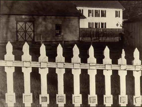
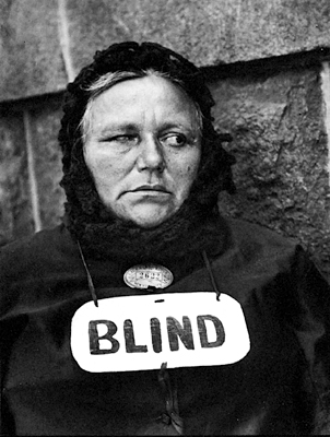
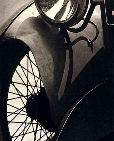
In my Street Photography, I pay homage to Paul Strand, the photographer that I chose to pay homage to by not just taking photo of people wondering around the street. But also, I had taken photo of building or Cars, or anything on the street that would create some kind of pattern. Like in Paul Strand’s Photography, he would often take some photos of some object that is plain and simple and makes it into unique pattern. Therefore, I believe that in order to pay homage to him, I would too, takes photo of not just people wondering around streets but instead have some sort of pattern. The differences between our photos are that, in my photo, I had more of a High contrast while he had more of a Low contrast. The reason probably is, because of the difference or the uniqueness of the contrast that attracted us to different things. Also, the difference between my photo and his is on how we took our photo. The reason I stated this is because in each of the photo that I seen of his work were either portraits of people or pattern of object. In my work, it’s full buildings and landscape. But in some ways, we both had some sort of pattern together. This is how I pay homage to Paul Strand.
“Plain and Simple”
I still think that it’s still the quote that describes my photo, because once you look at it, you might be thinking. “ Why did she take this?” or “What’s so unique about this?” or even “ What is her message of this photo?” But if you look deep into it, you’ll see something that others might not see. Therefore, I believe I would still have the same quote “ Plain and Simple”
Wednesday, November 11, 2009
Final Slideshow=]
---------------------------------------------------------------------------------------------------------------------------------------------
This is the Slideshow, I got so far...Hope it's right according to the Final Project>.<
Begining of Final Project
...................................................................................................................................................................
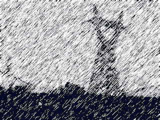
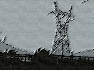
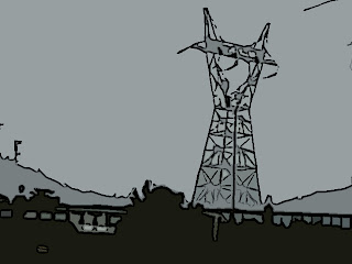
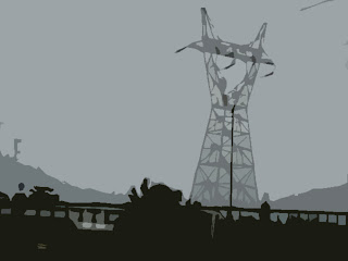
In these photo, I just edit it by using the Artistic Filter. They're edit with different Artistic Filter. For example, one was the "Underpainting". <---Which is the frist one that I post up there! The other three were, the "Crosshatch, Outcut and Colored Pencil" These are the four main Artistic Filter that I used mainly.
Basically, I used more Artistic Filter than the Paint Bucket or the gradient tools. I guess I'm just more use to the Artistic Filter. But I'll try to somehow, use the other in my other photo!=]
Wednesday, November 4, 2009
Begining of Project
Monday, November 2, 2009
New Assignment!
Just got new assignment today in class. The goal to this new assignment is to have a developing a distinctive editing style. Which we would have to create like three different groups.
Group #1 would have to include ARTISTIC filters. (meaning editing using the color-pencil and all those other options.)
Group#2 would have to include Color Effects/Gradient Tool.(Using the saturation or Variation, transparencies gradient tool, and lastly the desaturation.)
Group#3 would have to include the flat color CARTOON effect. Using the Paint Bucket as well.
All of this is due on the 11th and 12 of November. <---Last two days of the quarter....=]
HOPE I DO GOOD!!>.<
Wednesday, October 21, 2009
Project
Hope that this is right..I try so many things on this project! I Hope it's the correct way of doing it! Baiscally, in the photo I just change the light post into a tree. I was planning on changing more things but don't have that much time! BUT I WILL SOON!!! BRB!!! Need to work on the project due for the quarter!!!
Friday, October 9, 2009
-Inspiration of Paul Strand-
Wednesday, October 7, 2009
More Desaturated Photo;
Tuesday, October 6, 2009
Desaturated Photos:
Wednesday, September 30, 2009
My Black and White Photos:
My first black and White Photo. It's a picture of my Mom, setting up some vegetable outside.

This photo was taken on the 29th of September. The little boy(my brother), was trying to climb the chair. So I just took a snap shot of it before he actually climb the chair.
MORE BLACK AND WHITE PHOTO:


Labels:
aciey,
Black and White photos,
family
Tuesday, September 29, 2009
Other Photos of Paul Strand....
Monday, September 28, 2009
Paul Strand
Subscribe to:
Comments (Atom)


